3.12 Branding |
It is possible to change the application's name, the company's name, the e-mail address to which support e-mails will be sent by default and the colors used by RAYGUIDE. How this is done is described in this chapter.
As mentioned in chapter 3.10 Files and File Formats
RAYGUIDE stores its configurations in folder
C:\ProgramData\RAYLASE\RAYGUIDE\Configurations\.
If in the configuration folder a file named
SplashScreen.bmp,
SplashScreen.png or
SplashScreen.jpg
is found, the file is loaded when RAYGUIDE starts and shown during the start-up phase.
If in the configuration folder is a file named Branding.json available at program start, it will be read out, and the application and company name found in it will be displayed in the main window's title line.
When RAYGUIDE's menu item Help/Contact support... is triggered by the user, a support e-mail is generated. It will be addressed to the recipient given in the file's "SupportEmailAddress" field.The file must be in JSON format and should contain just these five lines:
{
  "AppName": "Test title",
  "CompanyName": "RAYLASE GmbH",
  "SupportEmailAddress": "thisIs@fantasyAddress.com"
}If in the same folder C:\ProgramData\RAYLASE\RAYGUIDE\Configurations\ a file named ColorScheme.xaml is found, the colors in it are used. The file with RAYGUIDE's default RGB values looks like this:
<ResourceDictionary xmlns="http://schemas.microsoft.com/winfx/2006/xaml/presentation" xmlns:x="http://schemas.microsoft.com/winfx/2006/xaml" xmlns:d="http://schemas.microsoft.com/expression/blend/2008" xmlns:mc="http://schemas.openxmlformats.org/markup-compatibility/2006" mc:Ignorable="d">

       <!-- highlight color: eg active tab -->
    <Color x:Key="Rayguide.Colors.Highlight">#FF0514</Color>

    <!--used by metro controls for highlight, eg. check in checkbox-->
    <Color x:Key="Rayguide.Colors.ControlHighlight">#EBEBEB</Color>

  <!-- Multiple colors (mostly used for background) ordered from darkest to brightest  -->
    <Color x:Key="Rayguide.Colors.AccentBase">#3C3C3C</Color>
    <Color x:Key="Rayguide.Colors.Accent">#4B4B4D</Color>
    <Color x:Key="Rayguide.Colors.Accent2">#646464</Color>
    <Color x:Key="Rayguide.Colors.Accent3">#b1b1b1</Color>
    <Color x:Key="Rayguide.Colors.Accent3.5">#c0c0c0</Color>
    <Color x:Key="Rayguide.Colors.Accent4">#d8d8d8</Color>
    <Color x:Key="Rayguide.Colors.Accent5">#F0F0F0</Color>
    <Color x:Key="Rayguide.Colors.Accent6">#ffffff</Color>

  <!-- color of the guide lines in the canvas -->
  <Color x:Key="Rayguide.Colors.GuideLine">Orange</Color>

  <!-- color used for tile boundaries -->
    <Color x:Key="Rayguide.Colors.TileBorder">Green</Color>
    <Color x:Key="Rayguide.Colors.SkippedTileBorder">Yellow</Color>

    <!-- color used for workspace axes -->
    <Color x:Key="Rayguide.Colors.WorkspaceAxes">#505050</Color>
</ResourceDictionary>
The colors are used at these places:
MahApps.Colors.Highlight
: Color of activated toggle buttons, the measurement line and RAYGUIDE's red design stripes.HighlightControlsColor
: Color of the Click & Teach progress bar.MahApps.Colors.Accent
: Background color of tabs and the small border around dialogs.AccentColor
: Background color of the canvas, RAYGUIDE's title and status bar, title bar of active panels, active radio buttons and check marks in menu items.MahApps.Colors.Accent2
: Background color of a dialog's title bar (when the dialog has the focus) and of GroupBox elements.MahApps.Colors.Accent3
: Color of the bottom border line of the canvas.MahApps.Colors.Accent3.5
: Unused.MahApps.Colors.Accent4
: Background color of selected list elements e. g. in the job element list.MahApps.Colors.Accent5
: Background color of RAYGUIDE's toolbar and foreground color of the menu names and the status bar.MahApps.Colors.Accent6
: Background color of the dialogs and the scan field in the canvas.GuideLineColor
: Color of the guide lines in the canvas.TileBorderColor
: Color of the borders of a "Tiler" container job element shown in the canvas.SkippedTileBorderColor
: Color of the borders of a skipped "Tiler" container job element shown in the canvas.WorkspaceAxesColor
: Color of the coordinate system's axes shown in the canvas.
Since not all colors can be changed (e. g. the foreground color of labels in dialogs is always black), one may benefit not so much from the color changing feature.
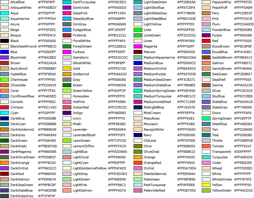
Just for convenience here is a table of the defined WPF colors:
